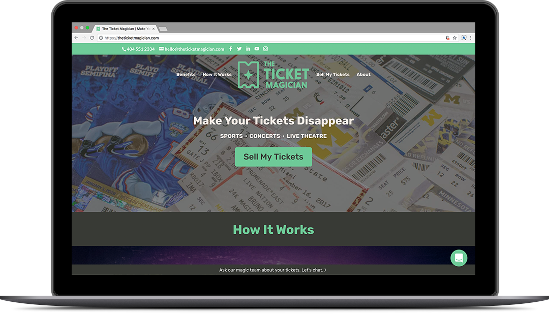
The Ticket Magician
Brand
The Ticket Magician approached Station16 with a company name, an inexpensive logo, and a dream – to sell people’s extra sports and concert tickets with white-glove customer service. The founders had provided this service to friends and family while running Dabble Entertainment, a ticket broker service, and were ready to spin it off as a new business.
Station16 began by developing a brand identity, including logo mark, type, and color palette. The new logo is suggestive of both a paper ticket and the capital letter M, with a single magician’s star in the center. The blue-green primary brand color is mean to grab one’s attention while standing apart from the colors of the 10+ platforms on which The Ticket Magician sells tickets.
Station16 developed brand language with the goal of being memorable but also informative, as the start-up was aiming for a niche market. “Make Your Tickets Disappear” was chosen as the tagline, with supporting language highlighting the business’s value propositions and benefits.

