Glisson
Brand
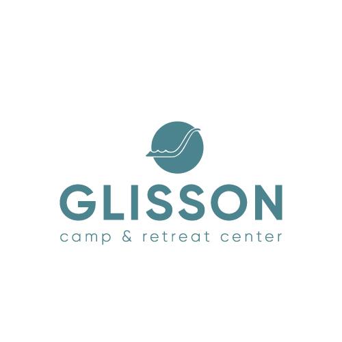
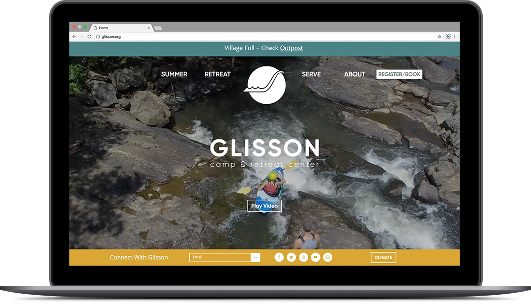
Founded over 90 years ago, Glisson sits nestled in the north Georgia mountains near Dahlonega. Over the years its branding had grown dated. As part of a transition from Camp Glisson to Glisson Camp & Retreat Center, Station16 updated the visual brand identity.
The long-established waterfall logo mark represents Cane Creek Falls, an iconic landmark on the Glisson campus. To honor the organization’s rich history and the loyalty of its thousands of camper alumni, we refreshed and modernized the waterfall mark rather than create something completely new and unfamiliar. Modern fonts and an updated color palette add to the visual message that Glisson is holding on to its heritage while moving forward into the 21st century.
Photography
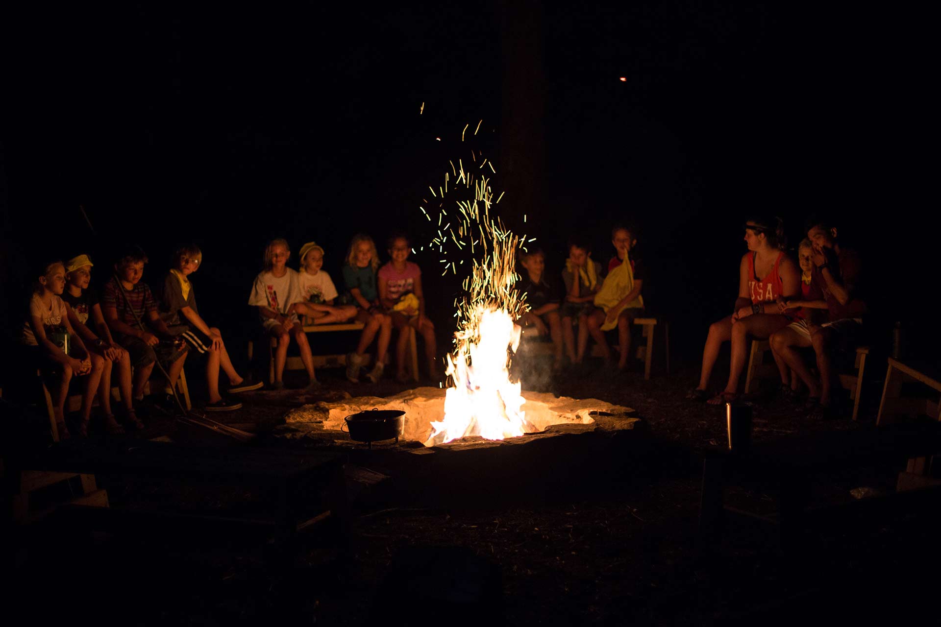
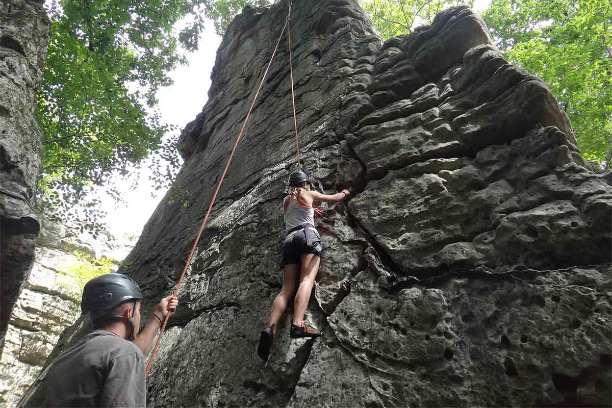
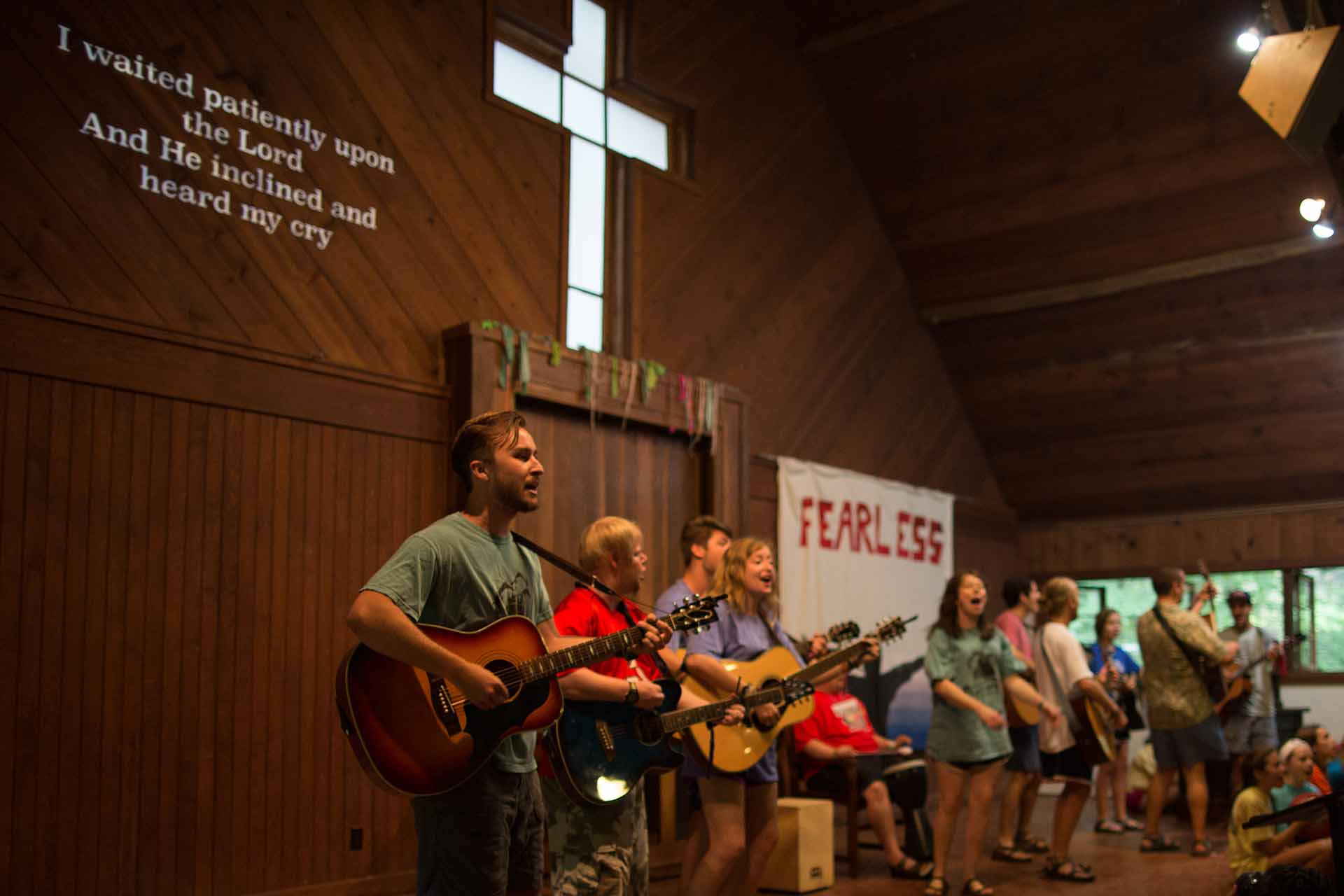
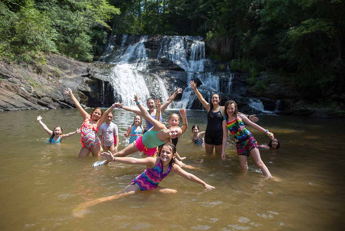
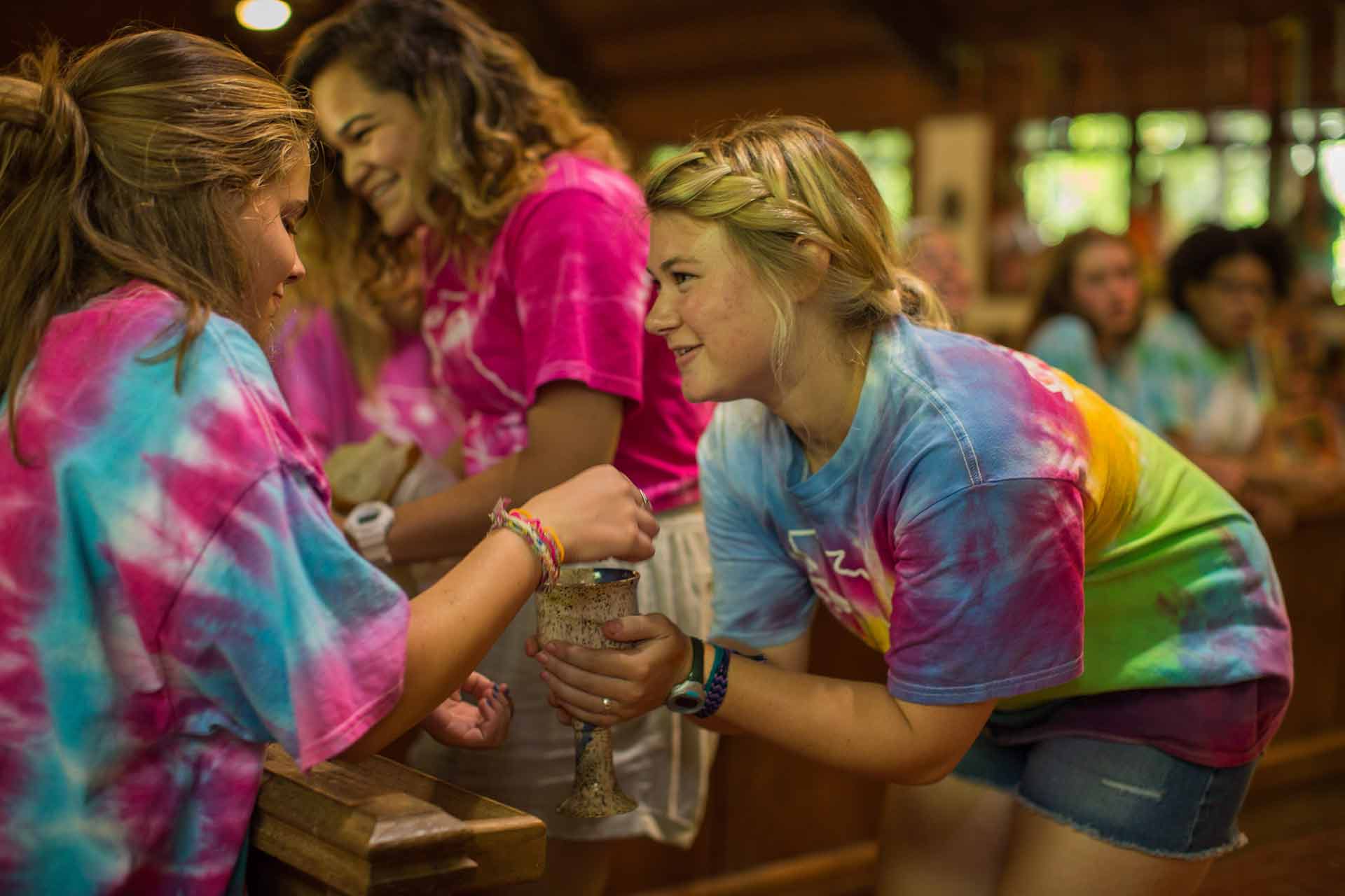
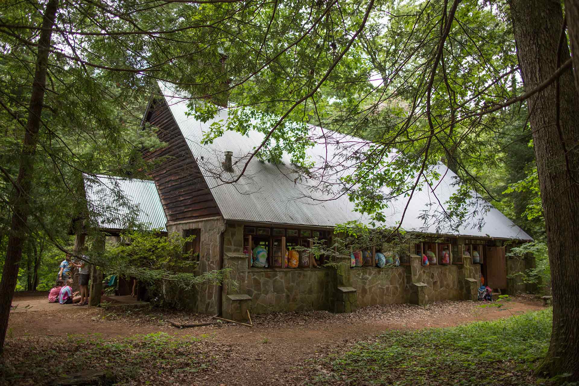
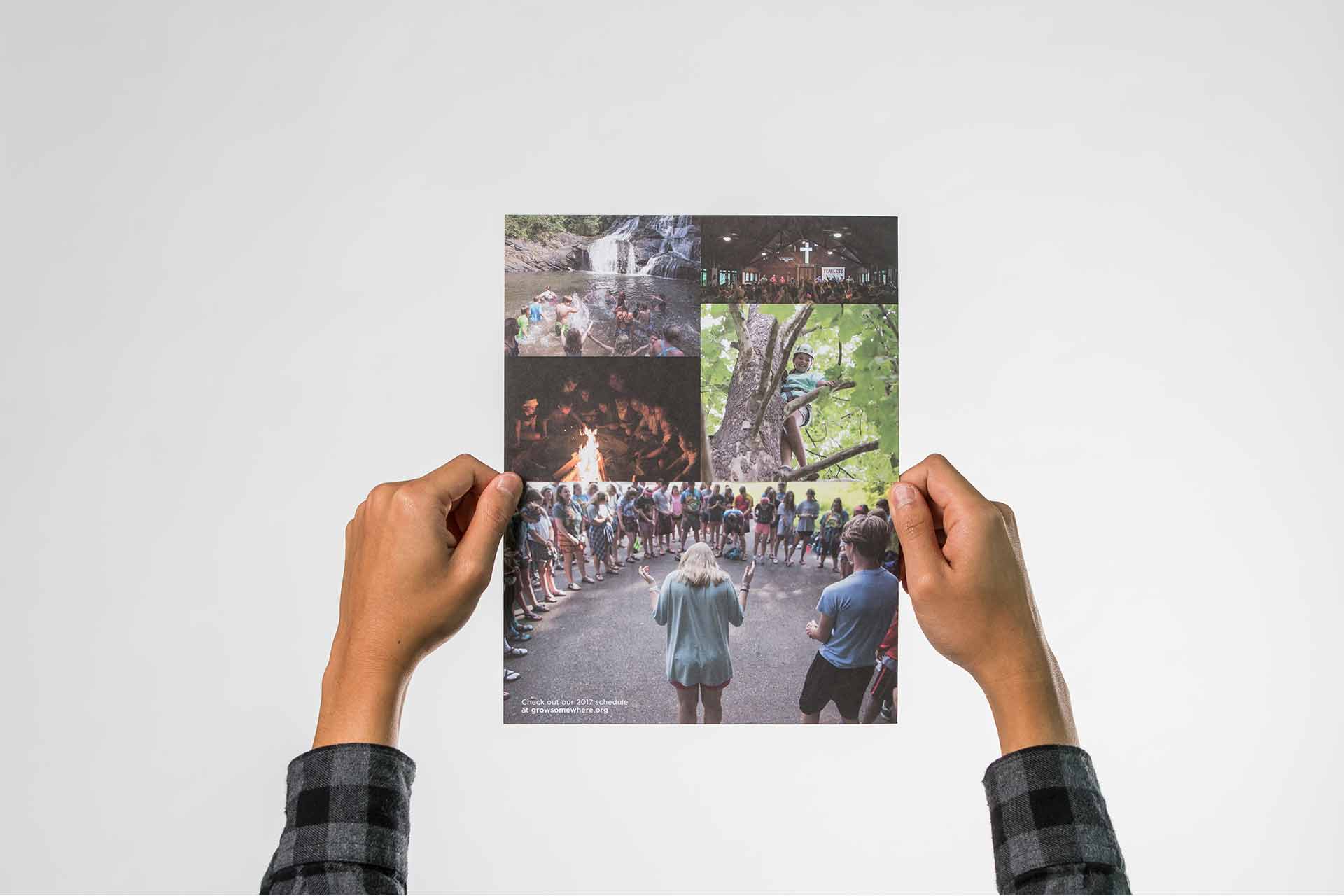
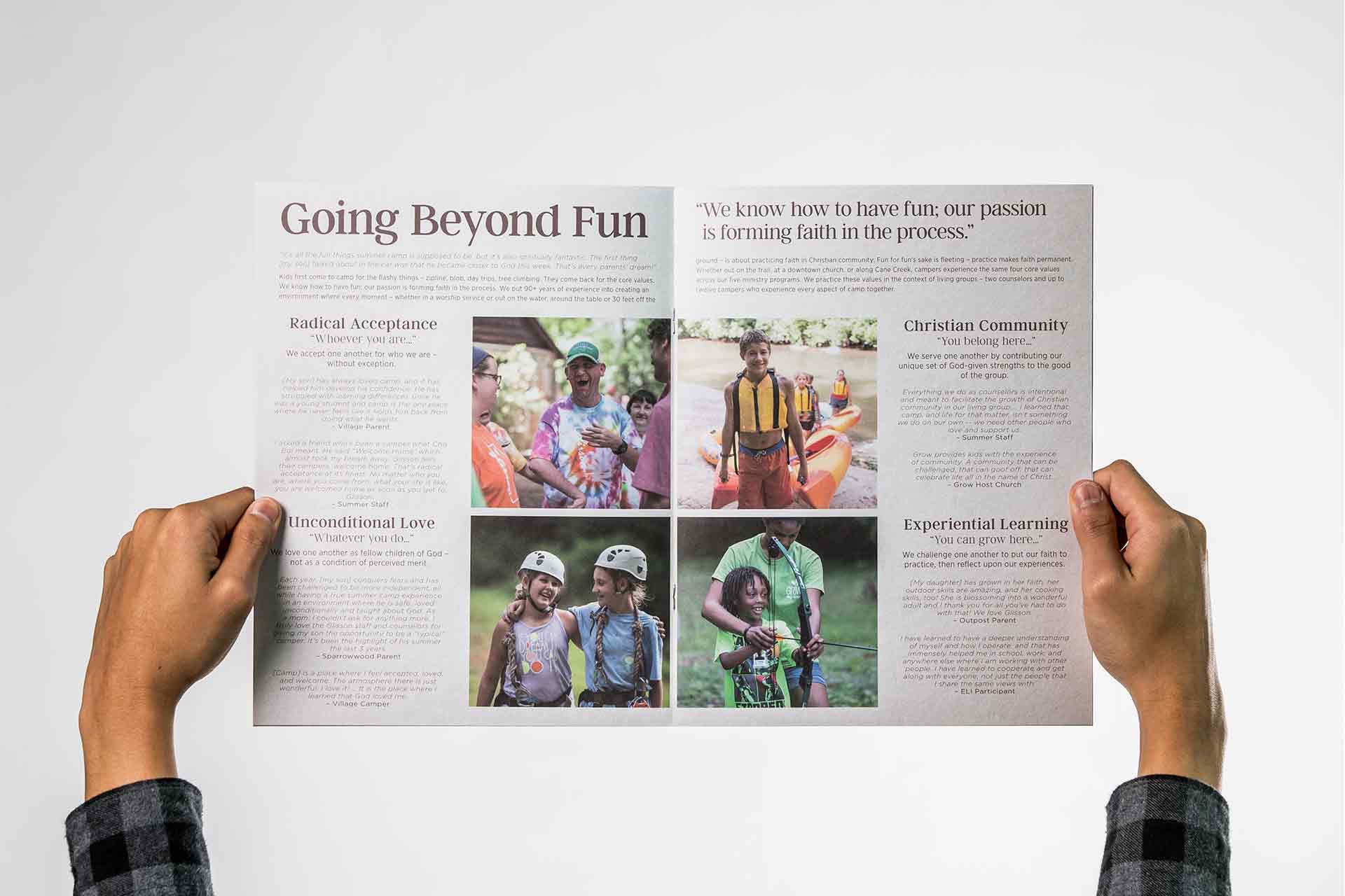
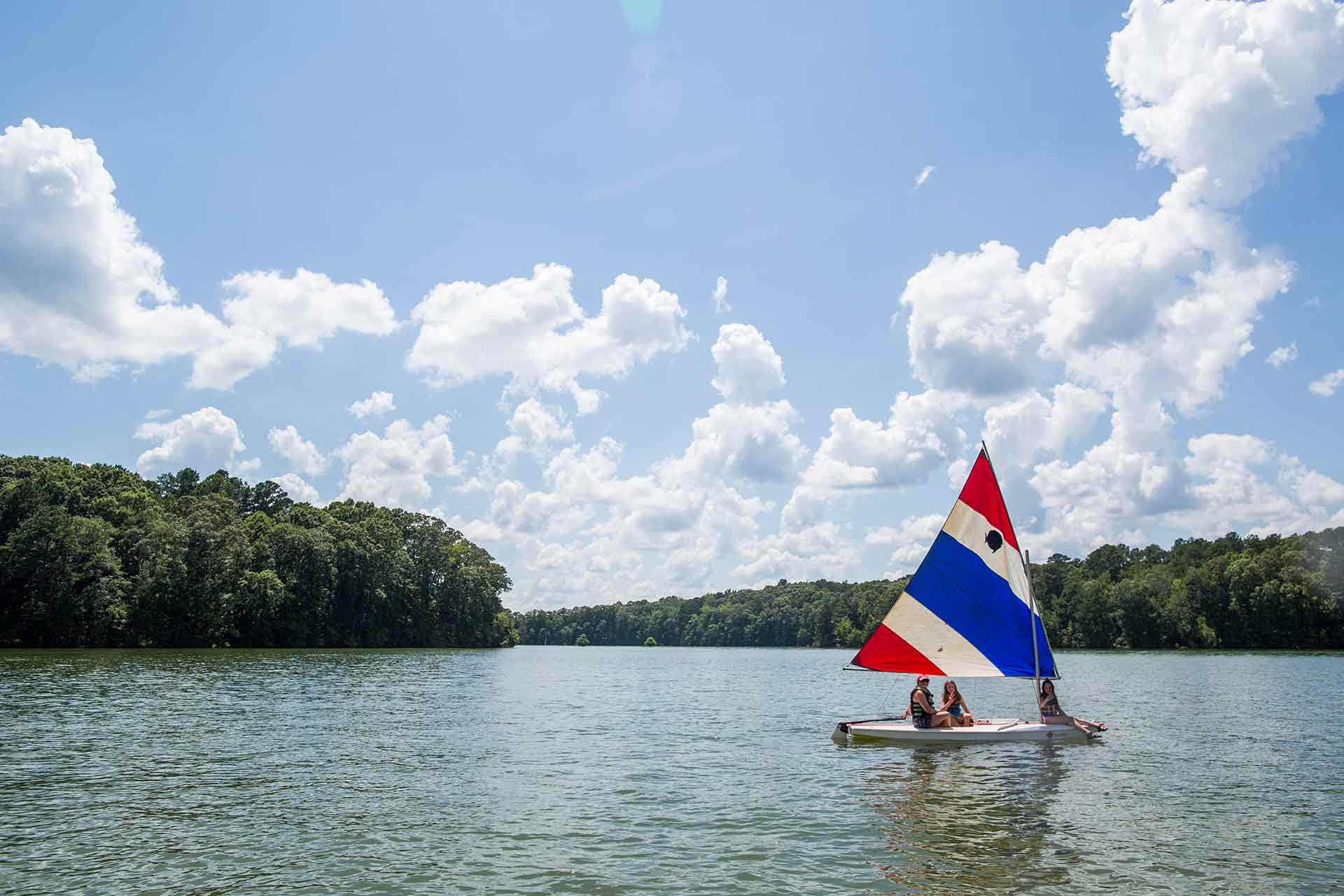
Extensive photography of Glisson’s three primary summer camp programs does wonders to illustrate the many activities offered as well as tell the story of the camper experience. All campers are encouraged to learn new skills, build relationships with each other, and cultivate their faith. Our photos, taken over several days worth of shooting, aim not merely to document but to involve the viewer in the Glisson story and vision.

